
A lead capture form works when it asks for exactly as much as the offer justifies and nothing more. Unlike a general contact form, it's built to qualify visitors and feed data straight into your CRM and follow-up sequences. If you fix one thing today, cut every field that isn't essential to fulfilling the offer or routing the lead; to understand why your app isn't growing, visit Save Your App. That single change usually beats a redesign.
TL;DR:
- Lead capture forms should only ask for essential information directly related to the offer to maximize completion rates and qualify leads effectively.
- The number of fields varies from one for quick offers like coupons to six or more for high-value B2B requests, with complexity justified by sales needs.
- Mobile-first design requires native input types, large buttons, inline validation, and proper accessibility features to ensure smooth user experiences.
- Connecting submissions instantly to your CRM, automations, and analytics is critical for quick follow-up and higher conversion rates.
- Testing form performance with metrics like drop-off points and behavior analysis helps optimize fields, placement, and CTA copy over time.
Table of Contents
- What Makes Lead Capture Forms Actually Convert?
- Copy These Lead Form Templates for Common Offers
- How Should Mobile and Multi-Step Forms Behave?
- Where Should You Place Forms, and What Should the CTA Say?
- What Integrations Turn Submissions Into Booked Meetings?
- How Do You Test and Improve Form Performance Over Time?
- Three Lead Form Setups and What They're Built to Do
- What an Agency Learns From Running Hundreds of These Forms
- Get Your Lead Capture Forms Built and Connected
- Sources
- FAQ
What Makes Lead Capture Forms Actually Convert?
A lead generation form captures visitor information in exchange for something worth having, whether that's a discount code, a demo slot, or a downloadable guide. A contact form just invites "get in touch." That difference matters because a lead form is supposed to qualify the person filling it out, not just collect a message.
Here's the checklist that separates forms people abandon from forms people finish:
- Match the ask to the offer. A newsletter signup earns one field. A custom quote earns five or six.
- Cut every nonessential field. Each additional field costs you completions; only ask for what you'll actually use in the next 48 hours.
- Use progressive profiling. Collect basic details now, enrich the profile on a second visit or during onboarding.
- Write CTAs that name the benefit. "Get the Guide" beats "Submit" every time.
- Place trust signals near the button. A privacy line, a security badge, or a client logo reduces hesitation right where it counts.
- Design for mobile first. Full-width buttons, native input types, and short field lists matter more on a phone than anywhere else.
- Connect submissions to your CRM immediately. A lead sitting in an inbox for six hours is a lead a competitor already called.
Skip any one of these and the form still works. Skip three or four and you'll wonder why traffic isn't converting.
Copy These Lead Form Templates for Common Offers
Field count should track the value of what you're offering and how much qualification your sales process actually needs. Below are four templates worth adapting directly, based on common offer types marketers rely on for lead capture.
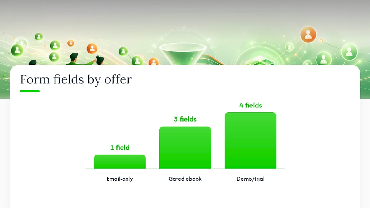
- Email-only (newsletter or discount code). One field: email. CTA: "Send My Code." Nothing kills a fast, impulse conversion faster than asking for a phone number.
- Gated ebook or guide. Email, first name, and (for B2B offers) role or company. Three fields is the ceiling here; a fourth field measurably drops completions on informational content.
- Demo or free trial request. Email, company name, role, and team size, with phone number as optional rather than required. This tells sales who they're talking to before the first call.
- Consultation or project intake. Scope, budget range, and timeline, in addition to contact details. The extra fields are worth the friction because they save a sales rep 15 minutes of discovery on the call.
For high-value B2B offers, a moderate number of fields up front is defensible when those fields cut real time out of the sales process and route the lead to the right rep immediately, especially when paired with a calendar link that turns interest into a scheduled call the same day.
Progressive profiling is the workaround when you're torn between "keep it short" and "I need more data." Ask for the minimum on the first form, then use a second interaction, a gated content download, or an onboarding step to fill in the rest. Multi-step forms and progressive profiling reduce the friction a long form creates by breaking the commitment into smaller pieces.
Pro Tip: Show your shortest field set first, even on a form that eventually asks for more. People commit to a form once they've filled in the first field, so front-load the easy stuff and reveal the rest after.
How Should Mobile and Multi-Step Forms Behave?
More than half your traffic is probably filling out forms on a phone with one thumb, so the form has to behave differently there than it does on a desktop mockup. A few fixes matter more than any color change:
- Use native input types (
email,tel,number) so the right keyboard pops up automatically. - Keep mobile forms to two or three fields on the first screen; anything longer needs a multistep flow with a visible progress bar.
- Make buttons full width and large enough to tap without zooming in.
- Validate fields inline, and write error messages that explain the fix instead of just flagging the problem ("Enter a valid email" beats "Invalid input").
- Set a logical tab order, label every field for screen readers, and use ARIA attributes so people using assistive technology can complete the form without guessing.
None of this is exotic. It's the difference between a form that feels like typing on a phone and one that feels like fighting it.
Where Should You Place Forms, and What Should the CTA Say?
Placement should follow how a visitor actually reads the page, not where the form was easiest to drop in. On a homepage, a short form belongs in the hero, above the fold. On a product page, an inline form near the pricing details works better than a popup. Blog posts do best with an inline form mid-content plus a slide-in near the end, timed to when someone has already read enough to trust you.
CTA wording carries more weight than most marketers assume:
- "Get the Guide" outperforms "Submit" because it repeats the payoff instead of describing an action.
- "Start My Free Trial" beats "Sign Up" for the same reason.
- "See Pricing" or "Book a Call" work better than "Learn More" on pages where the visitor already knows what you do.
For design, keep contrast high on the button, give the form breathing room instead of cramming it next to body copy, and put a trust badge or client count near the submit button, not buried in a footer. Thoughtful landing page design does most of this work before a single word of copy gets written. On exit-intent popups and modals, cap frequency to once per session and never trigger one before a visitor has scrolled at least partway down the page.
What Integrations Turn Submissions Into Booked Meetings?
A form that isn't connected to anything is just a digital suggestion box. The submission needs to trigger action within minutes, not sit until someone checks a shared inbox.
- CRM sync so every submission becomes a record instantly, with source and campaign data attached.
- Email provider integration for automatic confirmation and nurture sequences.
- Analytics connection to track which pages and campaigns actually produce leads.
- Enrichment tools that fill in company size, industry, or title from just an email address, so your form can stay short while your CRM record gets fuller over time.
- Lead scoring and sales alerts that flag high-intent submissions and notify a rep immediately.
Speed matters here more than most teams admit. A connected CRM and automation setup means a demo request can trigger a calendar invite and a Slack alert to sales in the same minute it's submitted, and routing leads quickly tends to correlate with higher close rates than routing them the next business day.
How Do You Test and Improve Form Performance Over Time?
Guessing which field is killing your conversion rate wastes weeks. Testing tells you in days.
- Track the right metrics. Overall conversion rate, field-level drop-off (where exactly people quit), time to submit, and what happens after submission, not just whether the form fired.
- Run targeted experiments. Test field count, field order, CTA copy, and placement, one variable at a time, because field count and CTA wording are among the variables most likely to move conversion.
- Watch behavior, not just numbers. Heatmaps and session replay tools show you exactly where someone hesitates or abandons, which a conversion percentage alone won't tell you.
- Give tests enough time and traffic. A test that runs three days on low traffic won't reach statistical significance. Plan for a few weeks unless your traffic volume is unusually high.
Field-level drop-off is the single most useful number in this list. It tells you exactly which question is losing you leads instead of leaving you to guess.
Three Lead Form Setups and What They're Built to Do
- Ecommerce coupon capture. One field, email only, instant code on submit. Speed wins over qualification because the goal is volume, not vetting.
- SaaS demo request. Multiple fields plus a calendar integration, so a qualified visitor lands a scheduled call before they've closed the tab. Higher friction, but far better qualification.
- Local service consultation. A multistep intake asking about scope and timeline before contact details. It filters out tire kickers and gives whoever calls back enough context to sound prepared, not scrambling.
Each setup trades speed for qualification differently, and the right choice depends entirely on what your sales process actually needs from the lead.
What an Agency Learns From Running Hundreds of These Forms
Most small businesses treat their lead form as a set piece: build it once, forget it. That's backwards. The form is the one place in your funnel where you get to watch, in real time, whether your offer and your audience actually match.
Industry changes the field list more than most people expect. A windows and doors company needs square footage and timeline up front because those two answers determine whether a quote takes five minutes or an hour. A solar lead needs roof type and utility provider before a sales call is even worth scheduling. Neither of those fields would make sense on a coupon form, and that's the point: the "best" field set doesn't exist independent of the offer.
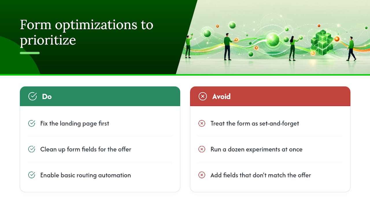
The teams that win aren't running twelve experiments at once. They fix the landing page, clean up the form fields, and turn on basic routing automation before touching anything else. Those three moves account for most of the conversion lift we've seen across client accounts.
— E
Get Your Lead Capture Forms Built and Connected
An agency can be an alternative to hiring a full internal marketing team for landing pages and lead forms that actually route to sales. Instead of a long-term retainer with vague deliverables, some agencies offer flat, transparent pricing per service per month, no long-term contracts, and work done in-house instead of handed off overseas.
If your current form is a static page with no CRM connection behind it, that's usually the fastest fix available. Crowdcompany's website creation and landing page service builds the page and the form together, and CRM and lead automation makes sure every submission triggers a confirmation, a lead score, and a sales alert instead of sitting in an inbox. Pair that with paid advertising if you need traffic to actually reach the new form. Browse the full services list and request a quick audit of your current form setup to see where leads are leaking before you spend another dollar on traffic.
Sources
For deeper reading on the mechanics behind this guide, LeadOps.io's guide to high-converting lead forms covers testing and field strategy in more detail, Mailchimp's lead capture form guide has additional template examples, and Smartsupp's piece on conversational lead capture is worth a look if you're considering chatbots alongside static forms.
- Lead Generation Forms: Best Practices & AI Techniques For 2026
- Leadops
- Create a Lead Capture Form That Works
FAQ
What is an example of a lead form?
A demo request form asking for email, company name, and team size is a common example, since those fields let sales qualify the lead before the first call. A coupon capture form asking only for an email address is another, built purely for speed rather than qualification.
How do you create a lead generation form?
Start by defining the offer, then choose fields that match its value: one field for a discount code, several for a demo or consultation request. Connect the form to your CRM so submissions trigger automatic follow-up, then test field count and CTA copy once traffic is flowing.
Are LinkedIn lead gen forms free?
LinkedIn's native lead gen forms are free to build, but running the ads that display them requires a paid campaign budget set through LinkedIn's ad platform. The form itself pre-fills with the visitor's LinkedIn profile data, which cuts fields but ties you to LinkedIn's own audience and cost structure.
What does lead capture mean?
Lead capture is the process of collecting a visitor's contact information in exchange for something of value, then feeding that information into a system that can follow up. It's the step between "someone visited your site" and "someone is now in your sales pipeline."
How many fields should a lead capture form have?
The right number depends entirely on the offer: one field for a newsletter or coupon, three to four for gated content, and up to five or six for high-value B2B offers like consultations or demos. Crowdcompany's CRM and lead automation service is priced at $500 per month if you want the form, routing, and follow-up built and connected together.