
A landing page is a single page built around one goal, and it only works when the headline matches whatever the visitor clicked to get there. The single rule that overrides every other design decision: nail message match and put the call to action where nobody has to hunt for it. Below, you'll find real inspiration sources, a conversion checklist, and a workflow to get a page live without guessing.
TL;DR:
- Use a headline that matches the traffic source and place the call to action where visitors don’t have to search for it.
- Keep forms short with no more than four fields, and ensure they validate errors inline to reduce abandonment.
- Prioritize message match, social proof placement, fast mobile load speeds, and contrasting CTA buttons to maximize conversions.
- Choose a layout pattern based on offer complexity: short-form for high-intent, long-form for education-heavy, or demo-focused for SaaS.
- Continuously test key elements like headline, form length, CTA copy, and visuals over multiple rounds for substantial performance improvements.
Table of Contents
- What Makes a Good Landing Page Design (and Where to Find Inspiration)
- The Core Elements Every Landing Page Needs
- Which Landing Page Layout Pattern Fits Your Offer?
- Builders vs. Custom Code: Choosing a Build Approach
- How Should You Test and Improve a Landing Page After Launch?
- A/B Testing and Iteration in Practice
- Mapping the Visitor's Journey From Click to Conversion
- Balancing Visual Hierarchy Against Content Density
- How Color and Branding Choices Affect Conversion
- Typography Choices That Keep Visitors Reading
- Accessibility Considerations for Landing Page Design
- Loading Performance Beyond Basic Speed Tests
- How Crowdcompany Approaches Landing Page Design for Local Businesses
- Get a Landing Page Built Around Your Actual Traffic
- Sources
What Makes a Good Landing Page Design (and Where to Find Inspiration)
Before you open a design tool, look at what's already working. Three categories cover almost everything you need.
Visual galleries like Dribbble show raw layout and color inspiration from working designers, though almost none of it is production-ready. Component libraries and builder marketplaces (Webflow's template store, Framer's marketplace, Unbounce and Instapage template galleries) give you pre-coded sections you can drop in and edit. Design system kits in Figma give you buttons, form fields, and typography scales already built to snap together.
Pull layout logic, not language. Note how a hero splits attention between headline and visual, how much whitespace sits around a CTA, how a pricing table draws the eye to one plan. Never copy another company's exact headline or testimonial text; that's someone else's brand promise, not a template.
Run anything you find through a short filter:
- Does the layout support a message match with your specific traffic source?
- Can you edit it without touching raw code, or does it require a developer?
- Does it render cleanly on a phone screen, not just a 13 inch laptop?
- Is it lightweight, or does it load five megabytes of decorative images?
Design experts consistently point people toward templates and component systems precisely because they eliminate the spacing and alignment mistakes that plague pages built from scratch.
The Core Elements Every Landing Page Needs
Every high-performing page shares the same skeleton. The details change, the structure doesn't.
- Hero section. The headline has to echo the ad, email, or search query that brought the visitor there. The subhead clarifies who the offer is for and what they get. The visual, whether a product shot or a short demo clip, shows the result, not just the product sitting there.
- CTA design and placement. Use an action-first label ("Get My Quote," not "Submit") with contrast high enough that it's the first thing your eye catches. Put one above the fold and repeat it at natural pause points, like after the benefits section and again at the bottom.
- Form design. Every field you ask for is a reason to leave. Cap it at four fields when you can, use conditional logic to ask for more only after someone's committed, and validate inline so errors show up before submission, not after.
- Social proof. A specific number ("312 five-star reviews") or a named client quote does more work near the hero than three paragraphs of copy about your mission. Recognizable logos help, but only if they're actually relevant to your visitor's industry.
- Performance and accessibility. Compress images before upload, lean on system fonts or a single subset web font, and make every button large enough for a thumb to hit without zooming in.
Conversion research consistently backs this list: message match, no navigation, social proof placement, and short forms show up as the top levers across nearly every framework tested. Separate guidance from Neil Patel points to the same four fields or fewer and mobile-first layout as the biggest early wins.
Pro Tip: Write your headline before you touch a single design element. If the headline doesn't match the ad or email that drives traffic, no layout fix will save your conversion rate.
Which Landing Page Layout Pattern Fits Your Offer?
Not every page should look the same, and the pattern you pick depends entirely on how much convincing your visitor needs before they act.
A short-form hero works for high-intent traffic. Someone who searched "emergency plumber near me" doesn't need three testimonials and a pricing breakdown; they need a phone number and a headline that confirms they're in the right place. A long-form page earns its length with cold traffic or a high-ticket offer, where the visitor needs education, objection handling, and proof stacked in sequence before they'll hand over their information. A demo-first layout, common in SaaS, leads with an interactive product preview because showing the interface beats describing it. Product-shot layouts dominate e-commerce landing pages because the image is the pitch.
Visual hierarchy decisions matter as much as the pattern itself:
- Use contrast (color, size, weight) to mark exactly one primary action per screen.
- Let whitespace do the separating instead of borders and boxes.
- Build a type scale with two or three sizes maximum, not seven.
- Add directional cues, like an arrow or a person's gaze in a photo, pointing toward the CTA.
Real product screenshots build more trust than illustrations for software offers, while illustrations work better for abstract services where there's nothing physical to show. Micro-interactions (a button that shifts slightly on hover, a form field that glows on focus) signal polish, but they only help if they don't slow the page down. As one design guide puts it, the right length and pattern depend on the offer, and testing against your actual traffic beats any general rule.
Builders vs. Custom Code: Choosing a Build Approach
Speed and flexibility pull in opposite directions, and picking the wrong one wastes a week you didn't have.
A visual builder (Webflow, Unbounce, Instapage) makes sense when you need something live fast and your team doesn't have a developer on standby. Custom HTML and CSS makes sense when you need tight performance control or a layout no builder template supports cleanly. Most small business teams should default to a builder unless there's a specific technical reason not to.
Once you've picked your starting template, the adaptation steps are the same every time:
- Swap the placeholder copy for your actual headline, subhead, and body text.
- Update brand tokens: your colors, logo, and font choices, not the template's defaults.
- Replace stock visuals with real product shots or screenshots.
- Check every responsive breakpoint, especially the awkward tablet width between 768 and 1024 pixels.
- Run a final message-match pass against the ad or email driving traffic.
Before you flip the page live, run through a short pre-launch pass: confirm message match one more time, test mobile load speed, verify your analytics and conversion tracking are firing, and make sure a privacy policy link sits in the footer. HubSpot's landing page process follows this same order: define the goal, pick the tool, write the headline, make the page helpful, then publish and test. Once a lead submits that form, route it straight into a CRM and automation flow so follow-up starts within minutes, not days.
How Should You Test and Improve a Landing Page After Launch?
A page that launches perfect on day one doesn't exist. What separates a 2% conversion rate from a 6% one is usually four or five rounds of testing, not a redesign.
Test in this order, because it front-loads the biggest wins:
- Headline first. It's the single highest-leverage element on the page.
- Form length second. Cutting from seven fields to four often moves conversion more than any visual change.
- CTA copy third. "Start My Free Trial" beats "Submit" almost every time.
- Hero visual fourth. Test a product shot against a demo clip or a customer photo.
Testing frameworks that prioritize headline first, then form length, then CTA copy consistently produce the largest early gains, since those three elements touch the most visitors before they ever scroll.
Watch four metrics: overall conversion rate, mobile conversion rate against desktop (they're rarely equal), time to first interaction, and bounce rate. Change one variable per test, run it long enough to gather a meaningful sample rather than calling it after a few dozen visits, and plan on a four to eight week cadence between rounds so you're not reacting to noise.
Pro Tip: If your mobile conversion rate sits more than a few points below desktop, stop testing headlines and fix your mobile load speed first. That gap is almost always a performance problem wearing a copy problem's clothes.
A/B Testing and Iteration in Practice
The mechanics of a single test are simple. The discipline to run a proper testing program for months is where most teams fall apart.
Split traffic evenly between two versions and let the test run until you've collected enough conversions to trust the result. A test that ends after 40 visits per variant tells you almost nothing; a test that ends after 2,000 tells you something real. Resist the urge to call a winner after three good days.
Document every test, even the ones that lose. A headline that dropped conversion 15% is just as useful as one that raised it, because it tells you something about your audience's actual motivation. Keep a simple log: what you changed, what you measured, what happened, and what you'd try next.
Iteration compounds. A page that's been through six rounds of headline, form, and CTA testing over a year performs meaningfully better than one built once and left alone, even if each individual test only moved the needle a point or two. Treat the landing page as a living asset, not a project with a finish line. Once you've won on the big three (headline, form, CTA), move to secondary tests: hero visual, social proof placement, page length. The returns get smaller, but they still add up.
Mapping the Visitor's Journey From Click to Conversion
A landing page doesn't exist in isolation. It's the middle step in a chain that starts with an ad or search result and ends with a form submission or a purchase.
Map the journey backward from the goal. What does the visitor believe when they click the ad? What do they need to believe by the time they reach your CTA? The gap between those two points is what your page has to close, and every section should move the visitor one step closer.
Cut friction at every transition. If someone clicks a Facebook ad promising a discount, and your page doesn't mention the discount above the fold, you've broken the chain. This is why message match matters so much: it's not a design nicety, it's the connective tissue between two moments in the same journey. Pairing a landing page with a retargeting strategy for the visitors who don't convert the first time extends that same journey instead of losing them entirely.
Watch for drop-off points using scroll-depth tracking or heatmaps. If most visitors bail right after the pricing section, that's not a coincidence, that's a specific objection you haven't answered yet. Fix the section causing the exit, not the whole page.
Balancing Visual Hierarchy Against Content Density
Every landing page fights the same tension: say enough to convince someone, without saying so much that they leave before finishing.
Visual hierarchy is how you win that fight without cutting content. Size, color, contrast, and position tell the eye where to go first, second, and third, even on a page dense with information. A long-form page selling a $3,000 consulting package can carry far more text than a short-form page selling a $20 impulse buy, as long as the hierarchy makes the dense sections skimmable.
Break density with structure rather than deletion. Convert a paragraph of features into a short table. Turn a wall of benefits into three columns with icons. Use subheads every few hundred words so a skimming visitor can still catch the shape of your argument even if they never read a full sentence. White space isn't wasted space; it's what lets a visitor's eye rest between one persuasive block and the next.

The mistake most teams make is treating hierarchy and density as opposites, cutting content to "simplify" a page when the real problem is that everything on the page has equal visual weight. Fix the hierarchy first. Often, the content didn't need to shrink at all, it just needed one clear headline size, one accent color for CTAs, and consistent spacing to become readable at a glance.
How Color and Branding Choices Affect Conversion
Color isn't decoration on a landing page. It's a signal system that tells visitors where to look and what matters most.
Pick one accent color for your CTA and use it nowhere else on the page. If your logo, your hero background, and your button are all the same shade, the button disappears into the noise. The button needs to be the visually loudest element on the screen, which usually means it should be the color that appears least often everywhere else.
Brand consistency still matters, but it takes a back seat to function on a landing page. Your homepage can lean fully into brand color; your landing page should borrow just enough brand identity (logo, one or two accent colors) to feel legitimate, while reserving your highest-contrast color purely for the action you want taken. A financial services page in muted blues and grays signals trust and stability. A flash-sale e-commerce page in bright reds and oranges signals urgency. Neither is universally "better," they're matched to the emotional state you need the visitor in.
Test color changes with real skepticism. The internet is full of claims that a specific button color increases conversion by some fixed percentage; that's rarely true across different audiences and offers. What's consistently true is that a button with strong contrast against its background outperforms one that blends in, regardless of which two colors you pick.
Typography Choices That Keep Visitors Reading
Typography fails silently. Nobody bounces from a page and thinks "the line height was wrong," they just feel like reading it was work, and they leave.
Limit yourself to two typefaces: one for headlines, one for body text. A third typeface for "accents" almost always makes a page feel unfinished rather than sophisticated. Within each typeface, build a scale of three or four sizes and stick to it: one for the hero headline, one for section headlines, one for body copy, one for captions or fine print.
Body text needs to sit between 16 and 18 pixels on desktop, never smaller, and line height should run about 1.5 times the font size so lines don't feel cramped. Keep line length under roughly 75 characters; a paragraph that stretches the full width of a wide desktop screen is exhausting to track across.
System fonts (the ones already installed on a visitor's device) load instantly and render consistently, which is why so many fast-loading landing pages default to them. If you want a branded web font, subset it, which strips out characters and weights you're not using, so it loads in kilobytes instead of megabytes. A beautiful headline typeface that takes an extra second to load is a beautiful typeface nobody with a slow connection ever sees.
Accessibility Considerations for Landing Page Design
An inaccessible landing page doesn't just risk legal exposure, it quietly excludes visitors who would have converted if the page had let them.
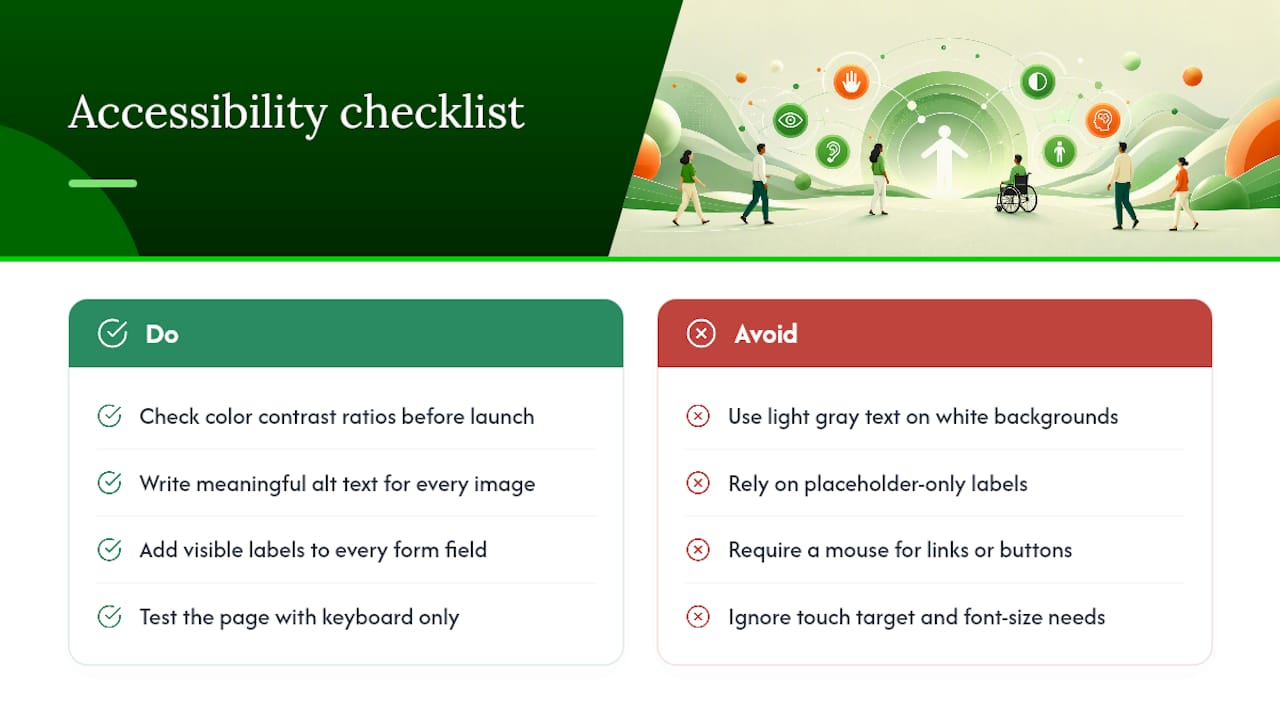
Color contrast is the most common failure point. Text needs enough contrast against its background to be readable by someone with low vision, which usually rules out light gray text on a white background, however trendy it looks. Run your color pairs through a contrast checker before you ship, not after a complaint.
Every image needs alt text that describes what it shows, not just for screen readers but because alt text also helps search engines understand your page. Every form field needs a visible label, not just placeholder text that disappears the moment someone starts typing, since placeholder-only labels vanish right when a visitor needs the reminder most. Buttons and links need to be reachable and operable via keyboard alone, which matters for visitors using assistive technology and for anyone whose mouse just broke.
Text size and touch targets matter as much as color. A CTA button needs to be large enough to tap accurately on a phone screen without zooming in, and body text needs to resize cleanly if a visitor increases their browser's default font size. None of this requires a specialist audit for most small business pages, it requires checking contrast ratios, writing real alt text, labeling every field, and testing the whole page with a keyboard instead of a mouse before launch.
Loading Performance Beyond Basic Speed Tests
Page speed scores measure the wrong thing if you only check them once and assume you're done. Real performance is about what happens as a visitor scrolls and interacts, not just how fast the first pixel appears.
Lazy loading is the biggest lever most teams ignore. Images and videos below the fold don't need to load until a visitor scrolls near them, which means a page with a hero video and ten sections of content can still feel instant, because nine of those sections aren't competing for bandwidth on page load. Most modern builders support this natively; if you're coding by hand, it's a one-line attribute on your image tags.
Defer anything that isn't essential to the first screen. Chat widgets, video embeds, and third-party tracking scripts can all load a beat after the initial render without a visitor noticing, and doing so frees up bandwidth for the content that actually needs to appear instantly. Performance optimization around image compression and asset loading consistently ranks as some of the highest-leverage conversion work available, precisely because slow mobile loads bleed visitors before they ever see your offer.
Test on an actual phone over cellular data, not just your office WiFi on a laptop. The gap between how a page feels on a fast connection and how it feels on a spotty one is usually where most of your mobile drop-off is hiding.
How Crowdcompany Approaches Landing Page Design for Local Businesses
We build landing pages the same way every time: start with the traffic source, match the message, then design backward from the CTA. If you've got the time and a designer on staff, plenty of what's above is doable in-house. If you need it live this month and converting from day one, that's the gap we fill for local businesses across our service areas.
— E
Get a Landing Page Built Around Your Actual Traffic
Crowdcompany is the alternative to hiring a freelancer or wrestling with a template alone. Instead of guessing at message match, we build the page around the exact campaign driving traffic to it, whether that's a Google ad, a local PR push, or a referral partnership.
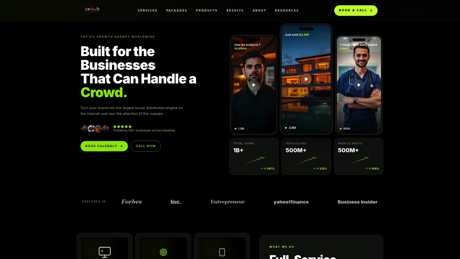
Our website creation and landing page service covers the full build: hero, form, social proof, mobile testing, and the analytics setup to track what happens after launch. If your landing page is meant to support a press push or a local feature story, our digital PR service makes sure the page and the coverage tell the same story instead of working against each other. For teams evaluating a coded build, our partners at Parent Technology offer WordPress-specific development if that's your existing stack.
Book a landing page audit with our team and we'll show you exactly where your current page is losing visitors, and what a rebuilt version could look like within a few weeks.
Sources
- HubSpot — Landing page design
- Landing page best practices: The Complete 2026 Guide
- Forbes Advisor — Small business website design
- MadeGoodDesigns — Landing page design guide